Black and white
is the original template for the movies; a perusal of any “Greatest Films of
All Time” list will reveal a bulk of black and white entries. One of the (many)
unfortunate aspects of contemporary media culture is that black and white
visual expression has fallen by the wayside, leaving great swaths of Millennial
viewers ignorant of it. Contemporary black and white cinematography is most
likely to be seen, when it is, in independent or foreign cinema, almost never
in major Hollywood releases or on television. Black and white has come to be
seen as an obstacle for viewers to overcome instead of something to embrace;
consider Ted Turner’s misguided “colorizing” of classic films to make them
accessible. Such a strategy is tantamount to producing a Shakespeare play from
one of those “No Fear” editions—easier comprehension doesn’t result so much as
grotesque cheapening.
 | |
| Yay... |
| ...or nay? |
Roger Ebert wrote in the first published edition of The Great Movies that “you cannot know the history of the movies, or love them, unless you understand why b&w can give more, not less, than color.” While there are numerous color films that are absolutely glorious, and films shot in either black and white or color that could just as easily have been the other way, I thought it worthwhile to consider some examples of films that could only be the films they are, with the impact they have, because they are black and white. I soon realized that such films also typically fall into a couple particular categories: Another Time, Another Sense, and We Couldn’t Stomach it Otherwise. But just as typically, these designations overlap.
 | ||
| Antonius Block(Max Von Sydow) and Death(Bengt Ekerot) |
Films
set in the distant past are often tailor-made for black and white. But historical
setting isn’t the only prerequisite for the absence of color; when the story
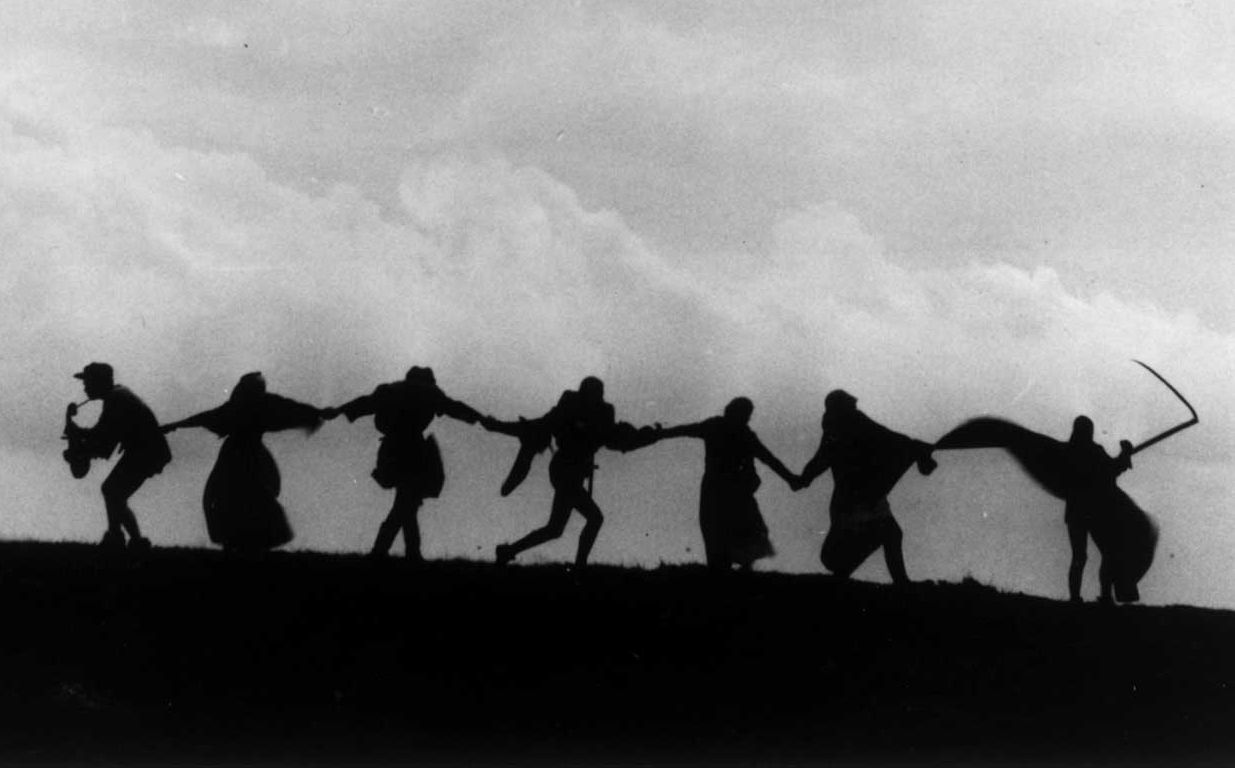
centers around spiritual or intellectual anguish, black and white seems apt. Ingmar Bergman’s The Seventh Seal (1956) absolutely has its allegorical power
anchored by black and white imagery. The stark, high contrast photography (courtesy
of Gunnar Fischer) is visually striking; it is difficult to imagine the rich
blackness of Death’s cloak, the eerie vacancy of the pale face, being
replicated with color. But the significance extends beyond visual aesthetic into
the story itself. The stark simplicity of the plague-ridden landscape Bergman
presents raises existential questions that cannot be brushed aside. If Death is
tangible and present, playing a game of chess or sawing down a tree with someone
perched on top, but God isn’t, where can humanity’s spiritual certainty reside?
Can it reside anywhere?
 |
| "The grim lord Death bids them dance." |
Andrei Rublev ( 1965), like the Bergman film, is set in
a medieval landscape filled with death and violence, its hero also tortured by
spiritual doubt. Whereas Bergman opts for allegorical starkness, director
Andrei Tarkovsky and cinematographer Vadim Iusov depict a world nearly
overwhelming in its brute reality. When the rain pours down and Andrei Rublev
shivers in the hovel with other pilgrims, we feel the damp cold. Smoke from
burning torches nearly stings our eyes. The blood of animal and human spilled
during the massacre in the city can almost be smelled. Black and white here
serves almost as a signpost for the ethos of the cruel period Tarkovsky shows.
Black and white. Life and death. Eat or starve.
However, there is a brief color montage at the end of the film; crucially, it is the only point in the four hour running time when Andrei Rublev’s icon paintings are shown. Transitioning as this montage does from the famous sequence detailing the casting of a giant bell, it serves as an evocation of the necessity for art in deriving meaning from a painful world. Such a mission achieves cinematic articulation because of this brief contrast between black and white and color.
A paradigmatic case of the blended categories for black and white necessity is The Elephant Man (David Lynch, 1980). Lynch and producer Mel Brooks initially encountered opposition from Paramount Studios when they requested black and white stock for the film, but they insisted and the film is undeniably more powerful for it. Cinematographer Freddie Francis uses the rich tones of the stock to create a palate of shadows and smoke, damp cobblestone streets reflecting back the light of streetlamps. It is a nightmarish vision of Victorian London Charles Dickens would’ve approved of, wrought by industrialization and hypocritical lack of empathy. Francis was a veteran of Britain’s Hammer Studios, which was famous for its monster movies. Such a background served him well for The Elephant Man; one of the film’s most singular achievements is how it functions like an inverted horror film.
 | |
| The brutal elements of a brutal world |
However, there is a brief color montage at the end of the film; crucially, it is the only point in the four hour running time when Andrei Rublev’s icon paintings are shown. Transitioning as this montage does from the famous sequence detailing the casting of a giant bell, it serves as an evocation of the necessity for art in deriving meaning from a painful world. Such a mission achieves cinematic articulation because of this brief contrast between black and white and color.
 |
| Andrei Rublev(Anatoly Solonitsyn)before the icon paintings |
 |
| An icon in color |
A paradigmatic case of the blended categories for black and white necessity is The Elephant Man (David Lynch, 1980). Lynch and producer Mel Brooks initially encountered opposition from Paramount Studios when they requested black and white stock for the film, but they insisted and the film is undeniably more powerful for it. Cinematographer Freddie Francis uses the rich tones of the stock to create a palate of shadows and smoke, damp cobblestone streets reflecting back the light of streetlamps. It is a nightmarish vision of Victorian London Charles Dickens would’ve approved of, wrought by industrialization and hypocritical lack of empathy. Francis was a veteran of Britain’s Hammer Studios, which was famous for its monster movies. Such a background served him well for The Elephant Man; one of the film’s most singular achievements is how it functions like an inverted horror film.
.jpg) |
| Unseen and feared |
John Merrick(John Hurt), particularly during the first half hour before he is clearly shown, has an eldritch anticipation given to his presence. What is this creature that makes people run in terror, that makes medical professionals gasp in shock? But when he is revealed, in an unpretentious reaction shot, the audience loses their fear of him; from then on fear for him takes its place. Just as black and white perfectly evokes the time period and mood, it is also essential to the presentation of Merrick. Black and white enables that which might have been repulsive or grotesque in color to become fascinating and, ultimately, relate-able.
| Seen and understood. Anthony Hopkins and John Hurt |
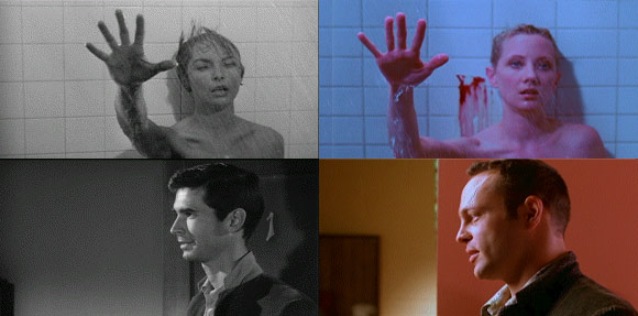
A
similar revelation is demonstrated by both screen manifestations of Psycho. The 1960 original, directed by
Alfred Hitchcock, was intended from the outset to resemble a cheap exploitation
flick. A key ingredient to this effect was shooting in black and white; it was all
the more conspicuous a choice following the VistaVision lushness of Vertigo(1958) and North by Northwest(1959). But black and white was also chosen
because Hitchcock felt that the picture would’ve been too gory and repulsive in
color. Upon closer analysis, the terror of the shower scene comes more from
Bernard Herrmann’s shrieking score and the montage constructed by George
Tomasini than from bloody drenching (chocolate syrup was used for blood during
shooting). John L. Russel’s black and white photography is essential to
heightening the other filmmaking components, and the result is a now legendary
scene.
How
interesting that what was shocking and diabolically artistic in the Hitchcock
film becomes crude and faintly laughable in Gus Van Sant’s “shot-by-shot”
remake. Color here proves a deficit, and not only because of the necessity of
an overdone wig to conceal the face of “Mrs. Bates”. The color schema
throughout the film is tacky and distracting; the parlor conversation between
Marion Crane and Norman Bates (played here by Anne Heche and Vince Vaughan,
both miscast) doesn’t convey the sinister undertones the original brought
through. Norman’s stuffed birds don’t have the impression of poising to swoop
that the black and white original gave them.
_shower_scene.jpg) |
| The fearful power of a silhouette |
 |
| Is it just me or is that a wig? |
 |
| There isn't much of a contest, is there? |
No comments:
Post a Comment